Terraria Tarot Cards
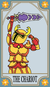
Chariot Card Front
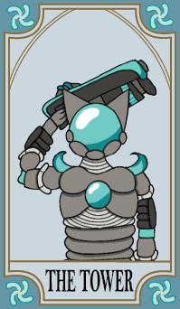
Tower Card Front
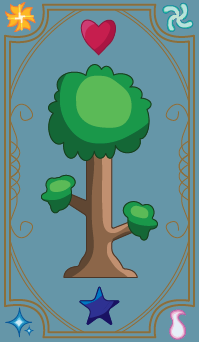
Card Back
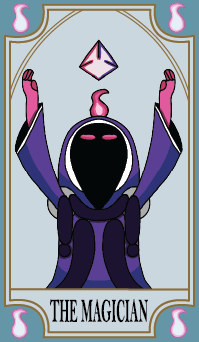
Magician Card Front
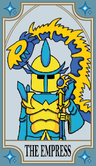
Empress Card Front
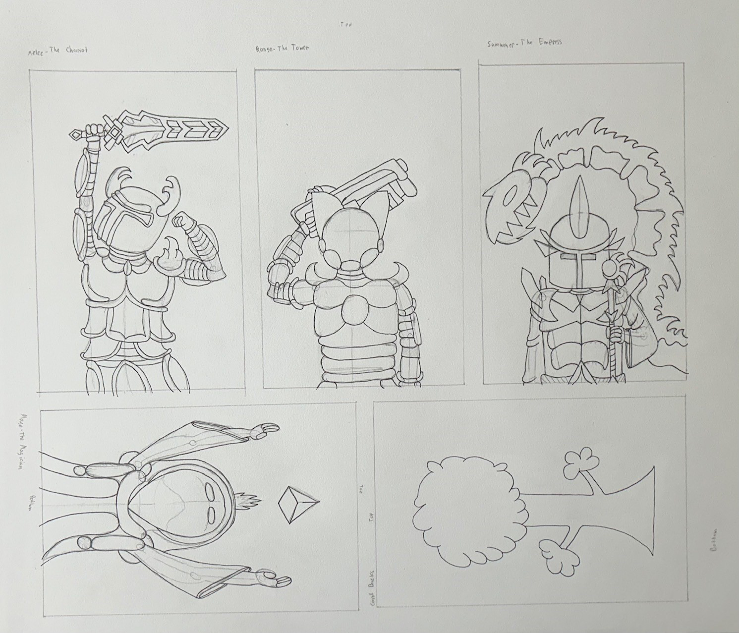
Outlining Sketches
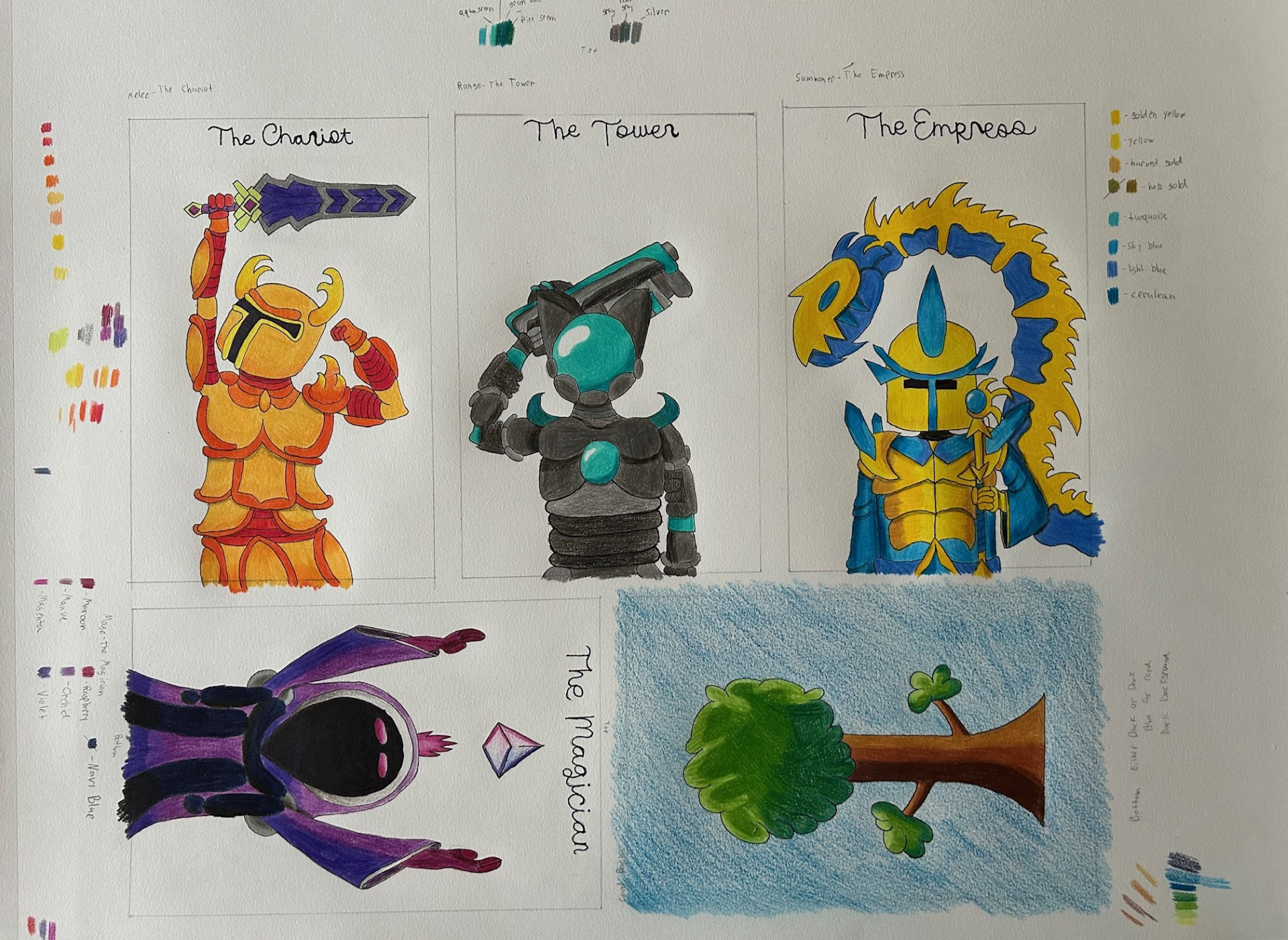
Original Hand-Drawn Cards
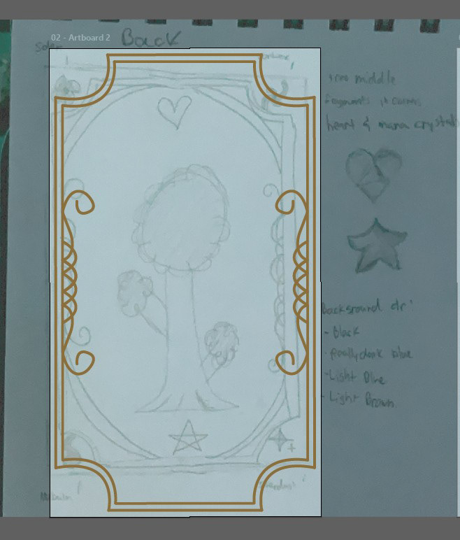
Making Back in Illustrator
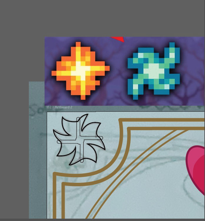
Making Fragments
I made some tarot cards based on one of my favorite video games, Terraria. I used Adobe Illustrator to create the card backs and borders, and Procreate on my iPad to draw and digitize the original hand-drawn cards I had made. I was faithful to the in-game sprites of armor they are based on, which is the best armor for the four different classes of fighting styles you can have in the game. The Chariot is the Solar armor and is the melee class that uses swords and close-range weapons. The Tower is the Vortex armor, which is the ranger class that uses guns and bows. The Magician is a mage who uses magic to attack and deal damage. The Empress is a summoner who uses summoned animals to deal damage. The four symbols on each of the card faces are called fragments that are used to create each of the respective armor pieces; all four of them are present on the card back along with a version of the logo for Terraria and a heart and mana crystal. The heart crystal increases your max health, and the mana crystal increases your max mana, which is what you need for magic weapons. Both are very important to the game, which is why I included them on the back.
Leaf Landscapers
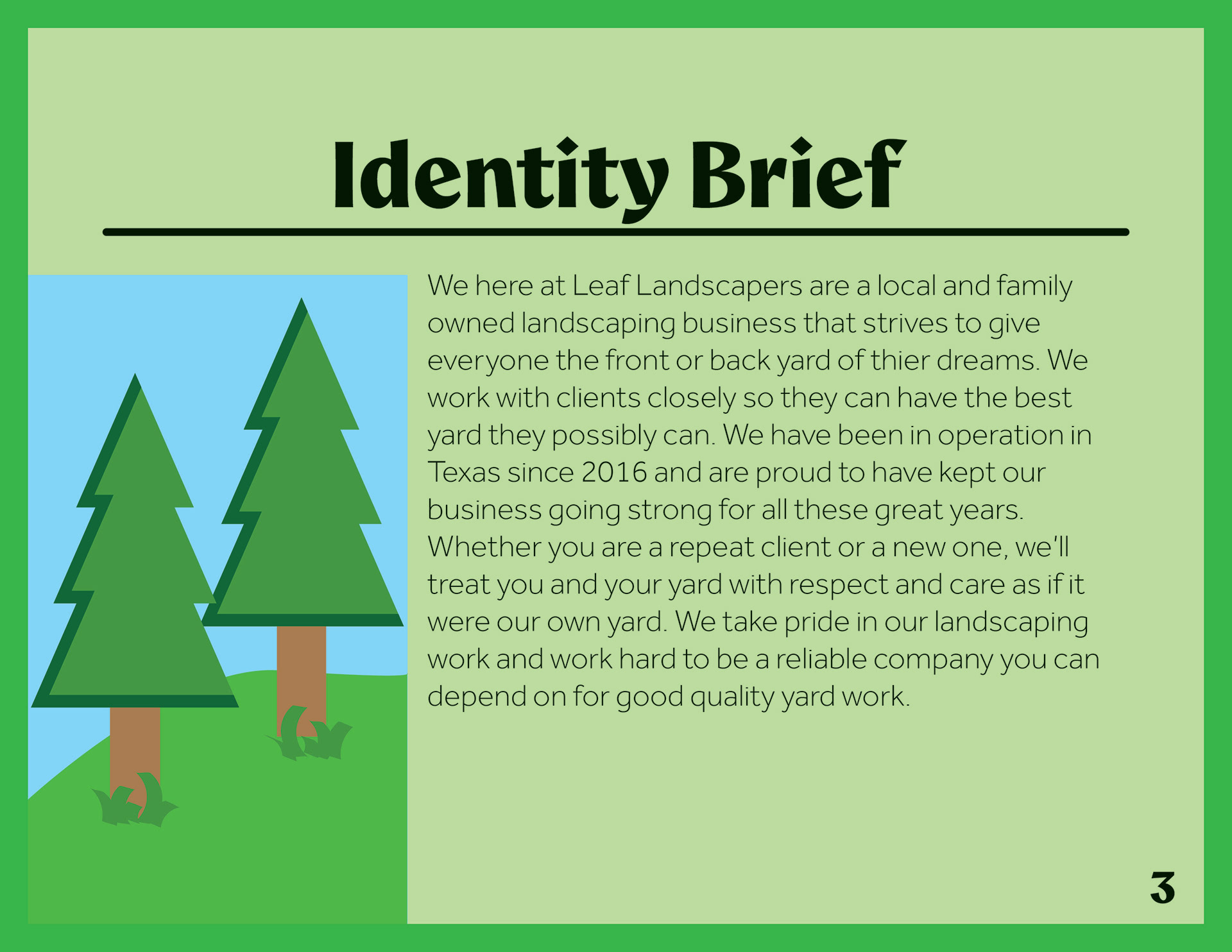
Leaf Landscapers is a landscaping company that I came up with that is located and operates in Texas. They do landscaping work for both front and back yards and do a variety of yard work, including planting shrubs, bushes, and flowers, trimming trees and bushes, installing walkways, mowing lawns, and other landscaping-related jobs. Below is the branding book for the company.
Page 1
Page 2
Page 3
Page 5
Page 6
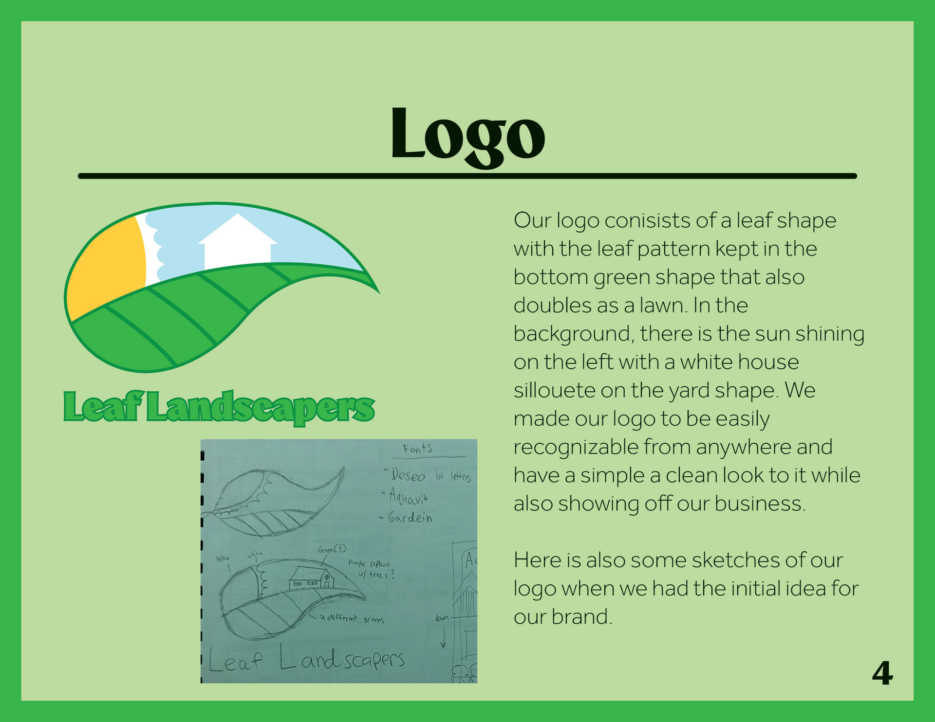
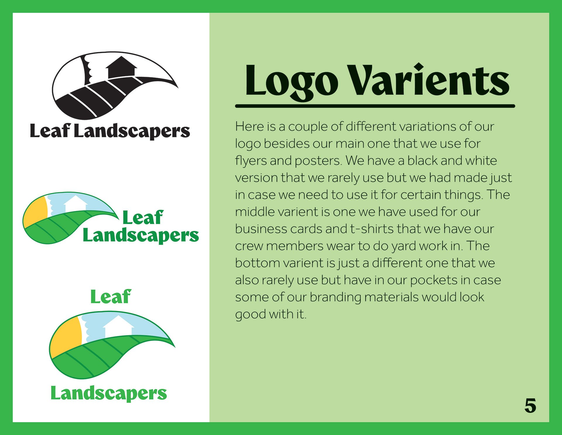
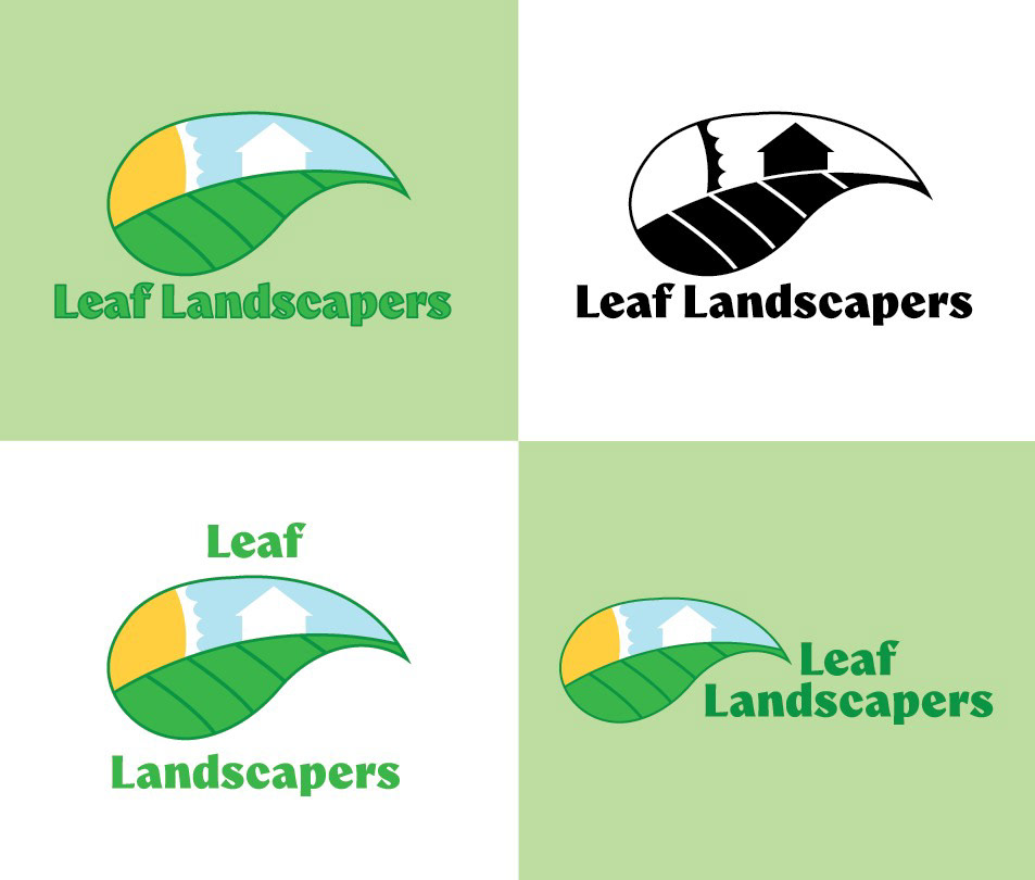
Here are some logo variants for Leaf Landscapers. Their logo is a leaf with a small landscape inside it. On the bottom is a leaf pattern that doubles as a yard for the white house silhouette in the background. There is a sun on the hill on the left of the logo. The typography used for the company name is elegant and conveys how clean a job Leaf Landscapers can do.
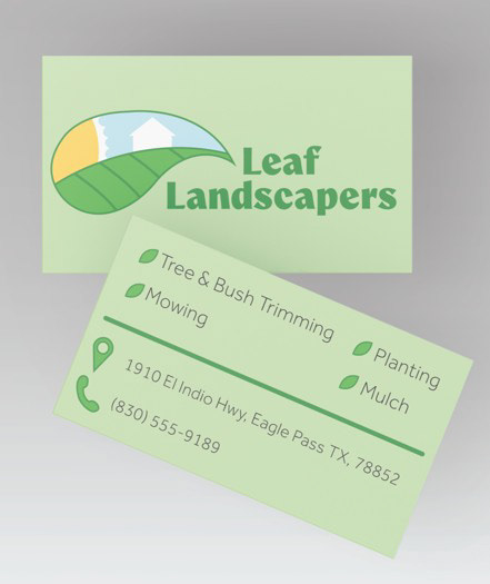
Here are the business cards for Leaf Landscapers in a mockup of how they would look when printed. The business cards keep the clean and simple look of the business and give the client a short list of some of the jobs they offer, as well as a phone number to call and a location to visit.
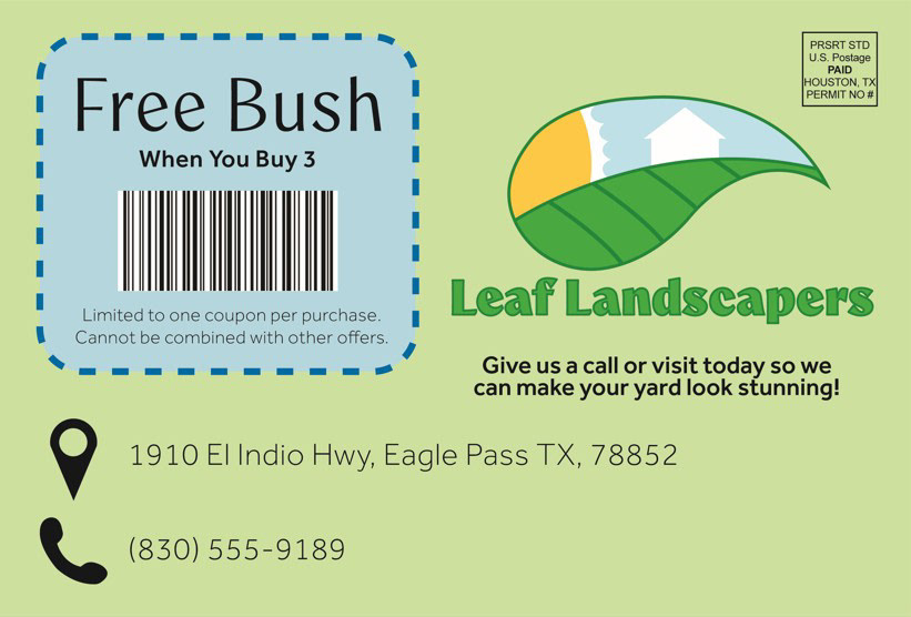
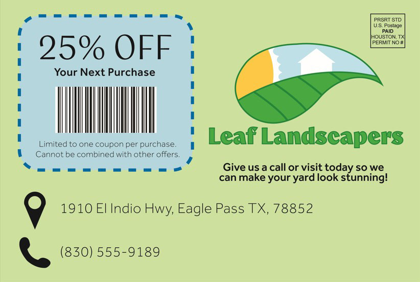
These are mail advertisements that include some coupons that clients could use on their next job done by Leaf Landscapers. These are mailed out to several people in neighborhoods to expand their business and help incentivize new clients to give them a call or visit and use the coupons. There are 3 different variations of ads that clients could receive in the mail, all with similar styles of Illustrations done on the front and similar backs with different coupons.
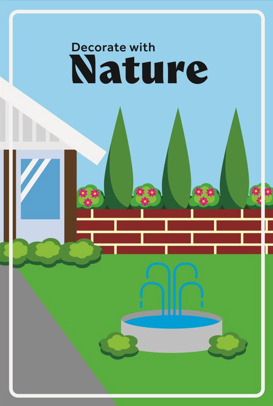
Front 1
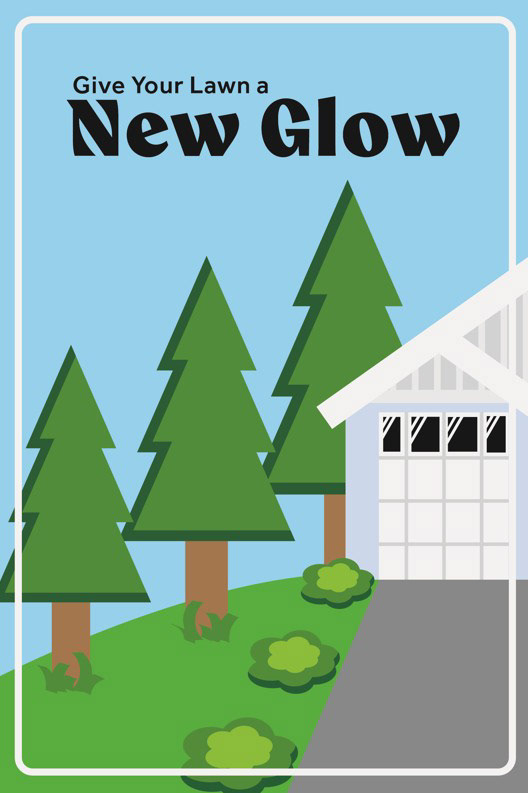
Front 2
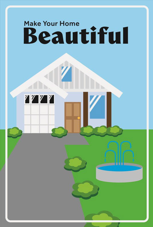
Front 3
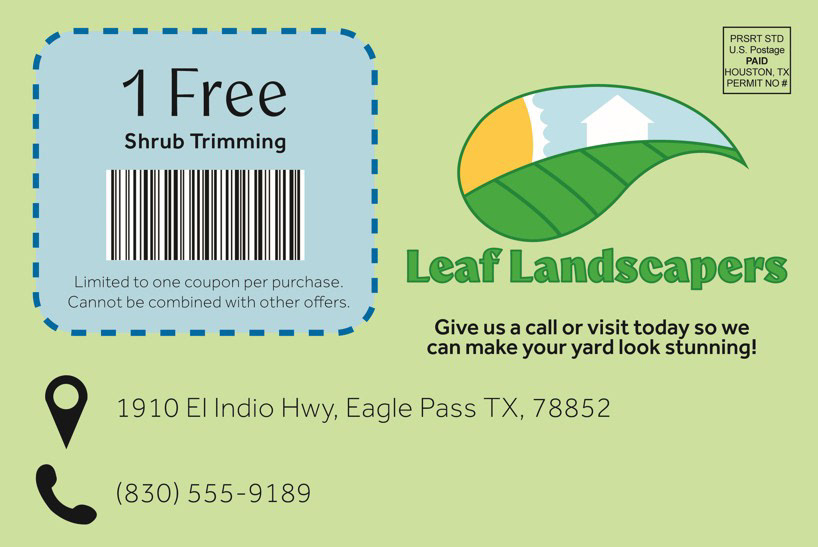
Back 1
Back 2
Back 3
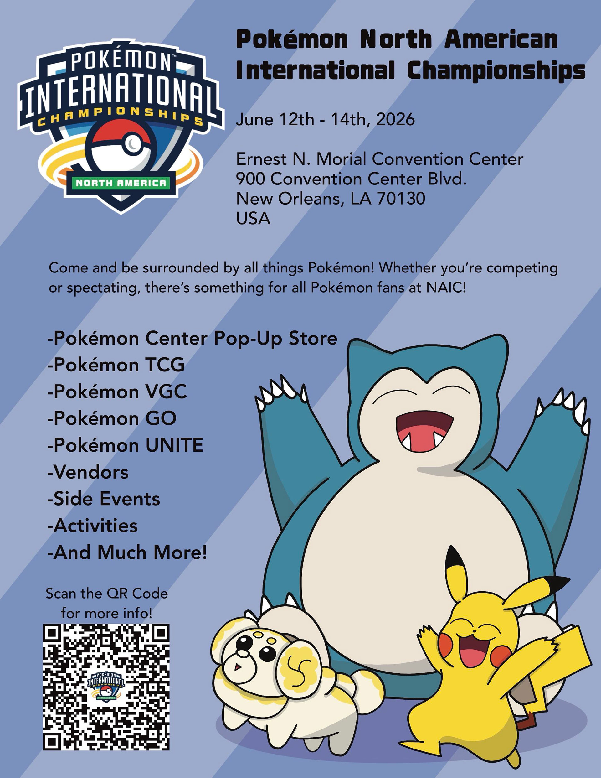
Pokémon NAIC Poster
A poster made for the Pokémon North American International Championships. I included a lot of information people would need to know, like the dates of the event, the address of where it will take place, and a short list of things that the event will have. I also made a QR Code that leads people to the official NAIC website, where they can get more information about the event, like where to buy passes, nearby hotels, and more detailed explanations on all the different events that will be taking place at the event. I hand-drew the three Pokémon in the bottom right, including two that are pretty popular, like Snorlax, the large blue one in the back, Pikachu, the yellow one on the right, and Fidough, the little dog on the left. I played around with the background colors until I landed on one that didn't mute out the colors of the Pokémon in the front. I included the stripes so the background wouldn't be a plain solid color, and I made sure it wouldn't distract the viewer's eyes from the text too much.